A logo should be practical, informative and relevant. A good real estate logo should be all of those things plus a little bit more. A good real estate logo should encompass the property’s tone and overall environment in a subtle yet impactful way. We’ve chosen a few real estate logos that hit the mark and get the job done!
1. Alaya Hollywood
Created with a desire to convey a chic, paradisiac, feel, Alaya Hollywood captures its audience with bold colors and impactful symmetry. This logo articulates the elegance and exclusivity of Hollywood while delivering a simple, yet complex design in a way that is both captivating and reminiscent of the brand.
2. Infinity Westshore
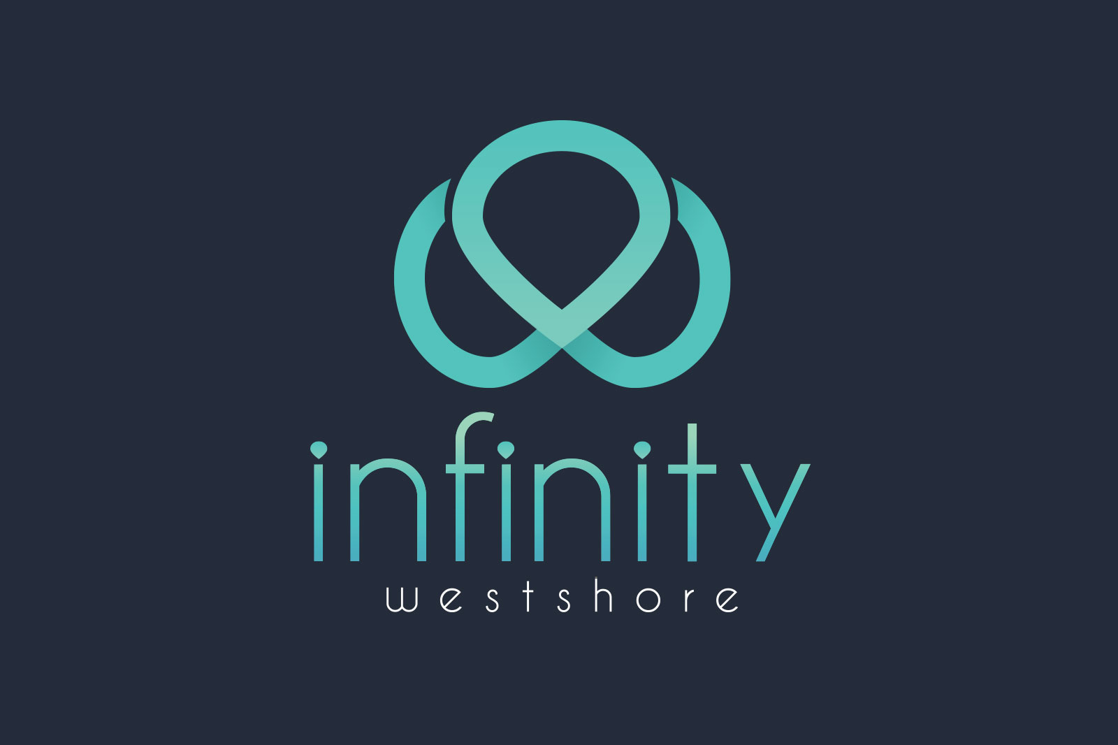
Inspired by Tampa’s scenic water views, the color for this logo is an ode to the illustrious coast.
The actual symbol component is a play on the properties name, look closely and you’ll see a marriage of the infinity symbol and the letter W.
3. The Millennium Mission Valley
Geared towards young professionals, the use of vibrant colors enhances this brand’s portfolio while staying true to the brand identity. The abstract lines used to form the “M” for Millennium reflect the architecture and design seen within the property, reinforcing the enviroment they offer to residents
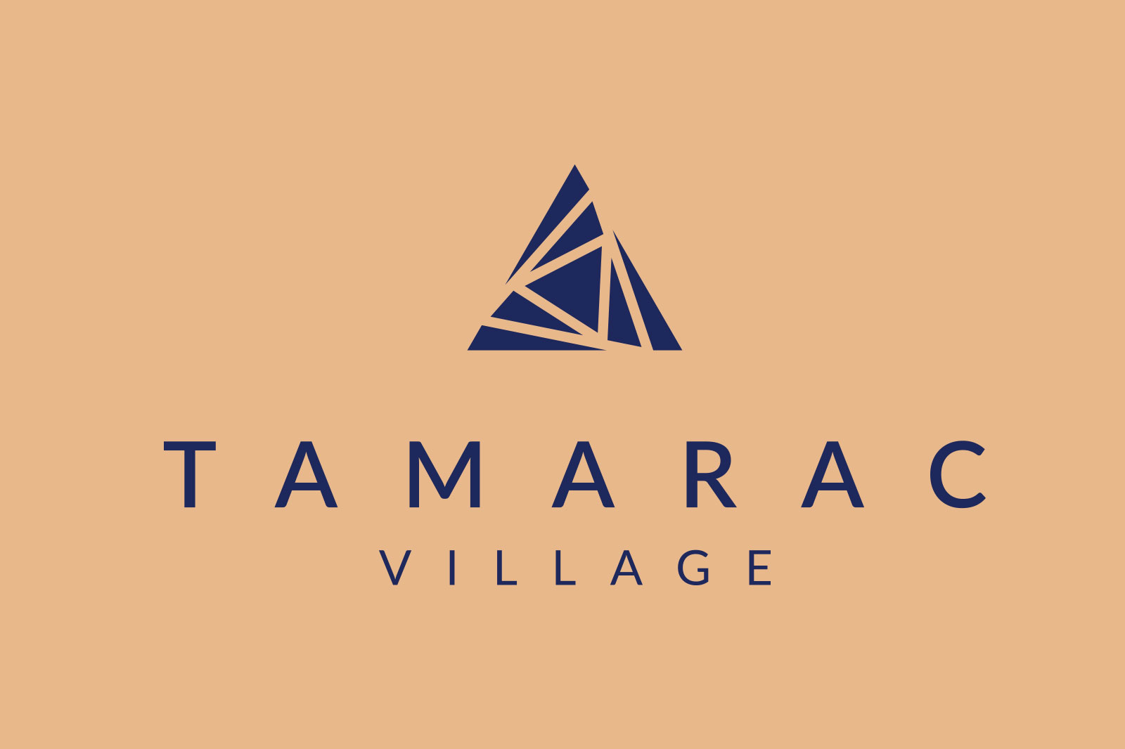
4. Tamarac Village
The Tamarac Village logo tells a story without overindulging the user. The use of triangles provides future residents with a sense of stability and reinforces a more unified communal experience that their audience is looking for.
By combining the variations of color and the forward movement of the triangles, designers were able to convey a forward moving motion putting the viewer in the mindset of evolution and forward thinking. Both of these practices are great methods for attracting the right residents with simplicity and design-thinking.
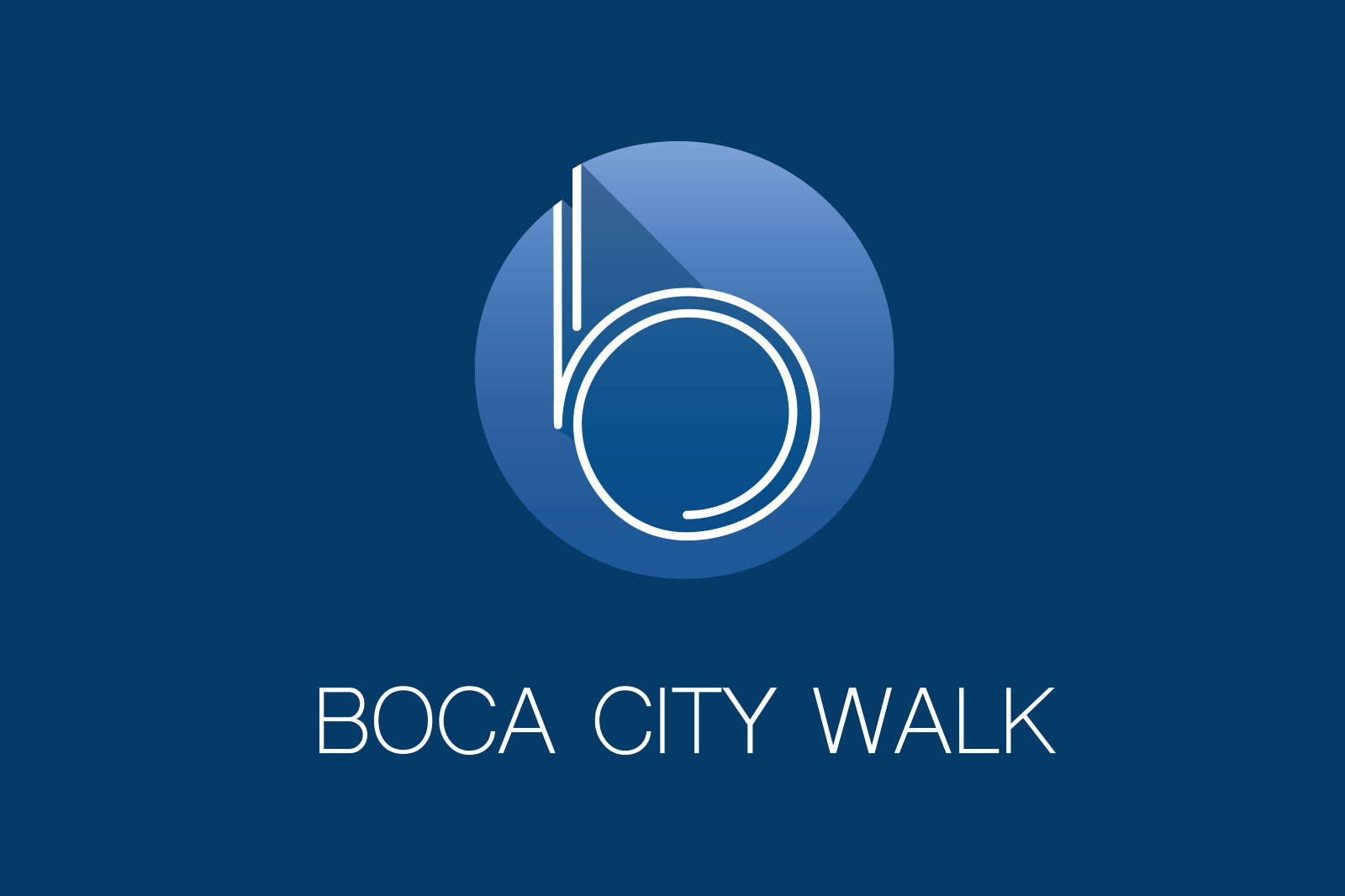
5. Boca City Walk
Designed to encompass a modern yet abstract tone, Boca City Walk displays bold hues of blue that attract future residents with a reminder of Florida’s coastal views.
The font type used along with the gentleness of the contrasting shade of white adds a subtle hint of art deco that entices future residents and reinforces this property’s brand identity.
All in all, your logo is more than a name, and it is more than an image.
When preparing your logo or creating an idea for a logo, remember to keep three things in mind:
- Who you are, and what your brand represents.
- This will help you stay true to brand tone, color, and aesthetics.
- Who your audience is and what will attract them.
- This will help you determine which direction your logo should go in as far as design and functionality.
- Simplicity and ease of use.
- By considering how your logo will be used and where you can decide how complex or simple your logo needs to be.
As a real estate professional, it is important to have a logo that represents your brand properly so you stand out from your competition.
Consumers generally develop an idea or conclusion about a brand within 10 seconds of viewing its logo. This means your logo has to not only represent your brand in 10 seconds, but it also has to convince the viewer that your property is right for them in 10 seconds.